Colors - Theme
Light - "Modern Parchment"
Dark - "Midnight Cartography"
Typography
Font Family: Nunito (Google Fonts)
Map Marker Colors
19 colors available for map markers. Applied as runtime tint on a blank post-it base image via ColorFilter.mode(color, BlendMode.multiply).
Color Palettes
10 themed palettes. Each palette assigns 5 colors to note types: Experience, Tip, Plan, Warning, Recommendation.
Icons and Assets
App Logo (Transparent)
Launcher Icons
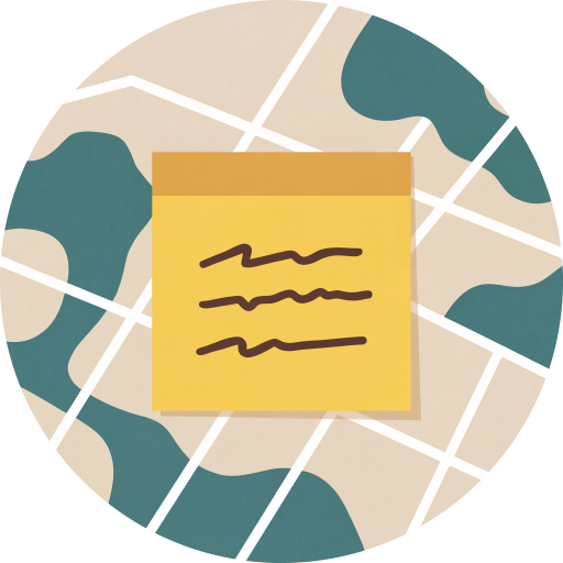
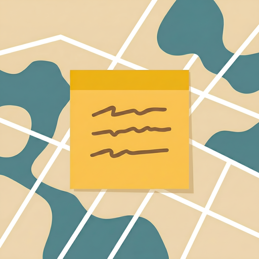
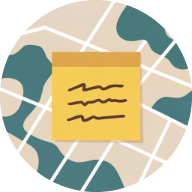
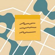
Post-it Note Markers
Map markers use a single blank post-it base image (postit_blank.png), tinted at runtime with the marker color via ColorFilter.mode(color, BlendMode.multiply) with a drop shadow. Unique squiggly lines are drawn programmatically on each marker, seeded from the place name's hash code so the same place always gets the same pattern.
 Blank base image
Squiggle generation
Each marker gets 2-3 squiggly lines representing text, drawn with cubic Bezier curves. The place name's hashCode seeds a Random generator, making each marker's squiggles deterministic and unique. Parameters randomized per marker: number of lines (2-3), line start/end positions, number of wave segments per line (3-5), and wave amplitude (2-10px). Lines are drawn at 45% black opacity with a 3.5px round-capped stroke.
seed = placeName.hashCode
rng = Random(seed)
lineCount = 2 + rng.nextInt(2) // 2-3 lines
// For each line:
segments = 3 + rng.nextInt(3) // 3-5 wave segments
amplitude = 2.0 + rng.nextDouble() * 8.0
// Draw cubic Bezier path with alternating direction
Note Type Colors
Each note type has a default marker color that conveys its purpose at a glance. Users can customize these via color themes or individual assignments, but these defaults establish the semantic meaning of each type.
Spacing System
A consistent spacing scale based on multiples of 4px. The 16px base unit is the most common value across the app.
Scale
4px
Tiny - icon gaps, tight component internals
8px
Small - vertical spacing between related elements
12px
Medium - component internal padding, chip spacing
16px
Base - card padding, screen margins, section gaps
24px
Large - section dividers, generous white space
32px
XL - empty states, splash padding, major sections
Common Patterns
Border Radius
Four radius tiers keep corners consistent. 12px is the default for most components.
Elevation & Shadows
Elevation is kept subtle to preserve the warm, paper-like feel. Light theme uses warm brown shadows; dark theme uses black.
Shadow Tokens
rgba(78, 52, 46, 0.08) - warm brown
rgba(0, 0, 0, 0.3) - neutral black
0 4px 24px rgba(78, 52, 46, 0.08)
Component Rules
Standard component styles used throughout the app. All components use Nunito and follow the border radius and spacing systems above.
Cards
#FEFCF7 / #2A2826
Buttons
#437D7D (light) / amber #E5A84C (dark). Radius 12px. Padding 24h x 14v.
Input Fields
#F0EBE0 / #353230. Radius 12px. Focus ring: 2px primary color.
Chips & Segments
Dialogs
#FFFBF5 / #2A2826.Snackbar
#4E342E (light) / warm white #E3E0DB (dark).
Map Styles
Light - "Parchment"
A warm, muted map style with parchment-toned land, soft beige roads, and teal water. Designed to feel like an old explorer's map while remaining readable. Labels use dark brown tones to match the app's text hierarchy.
Dark - "Midnight Cartography"
A deep, dark map style with charcoal land, dark slate roads, and near-black water. Teal accents on labels provide contrast without harshness, matching the app's dark theme palette.
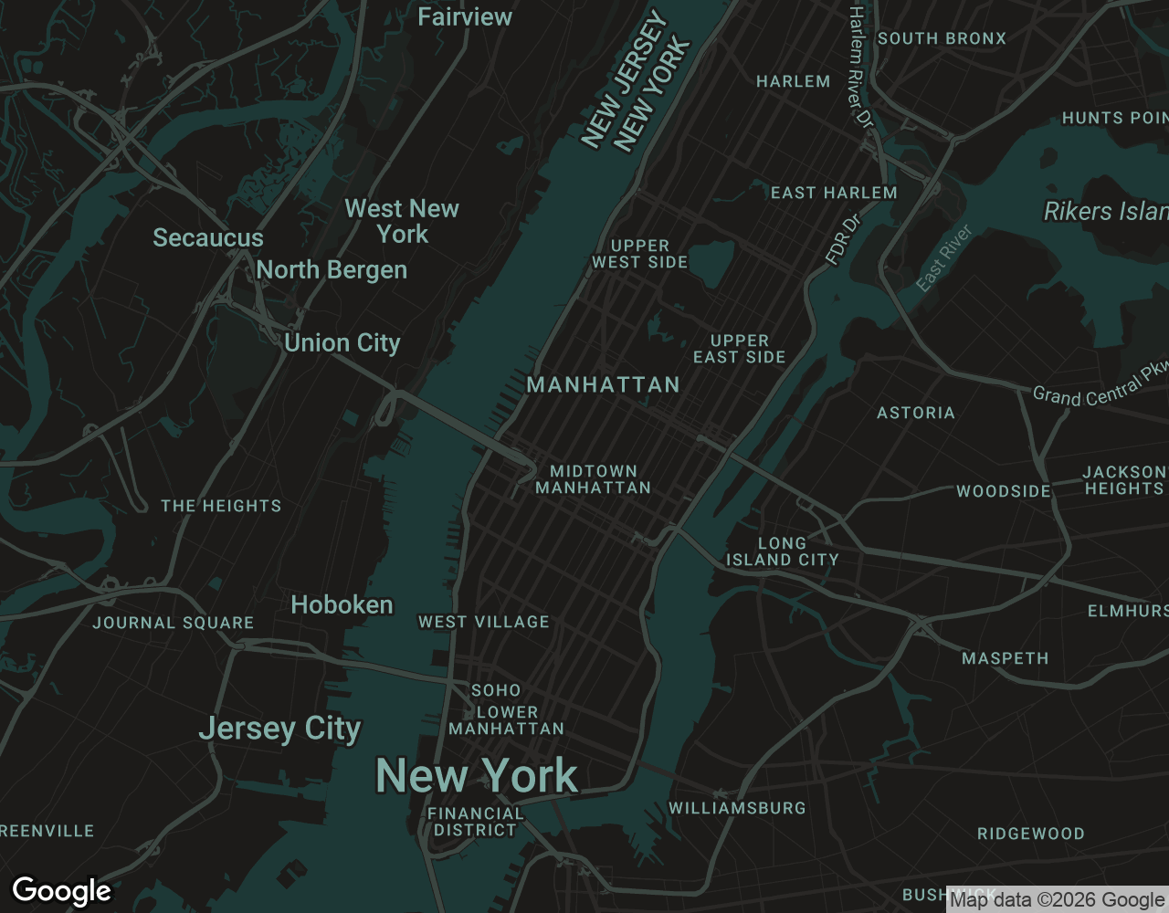
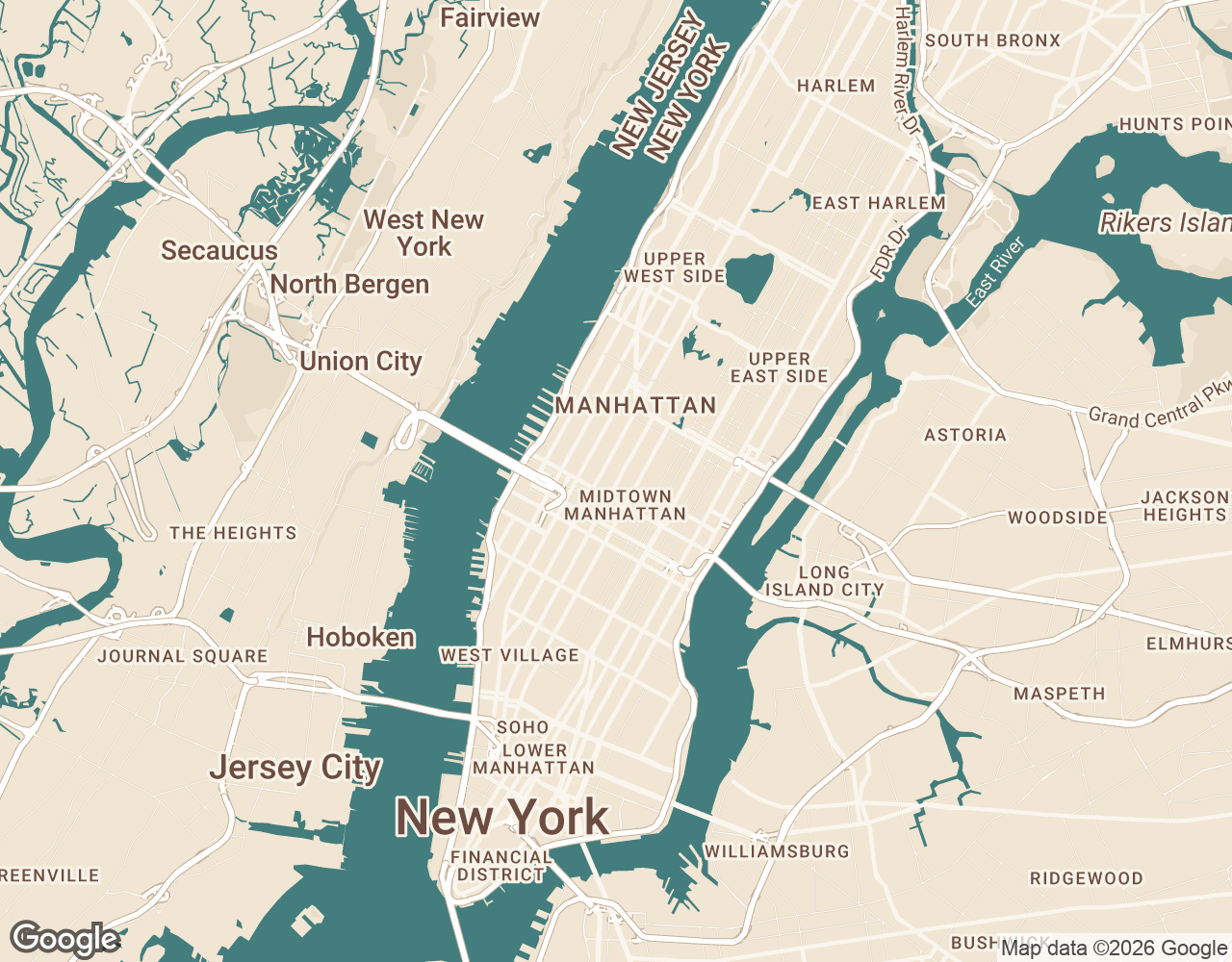
Drag the slider to compare light and dark map styles - Manhattan, New York